
Building a digital experience that moves people to action.
A strategy-led digital experience designed to improve clarity, strengthen product discovery, and create a smoother path from first interaction to conversion.
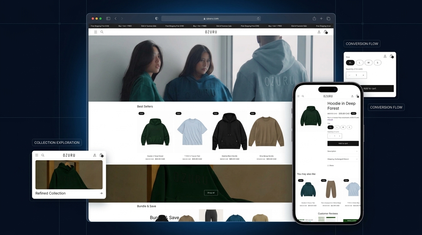
The problem wasn’t just the interface.
The experience needed greater clarity, stronger product discovery, and a more intentional path from interest to action.
Users could browse, but the experience did not create enough confidence to move forward.
The existing journey contained useful content and products, but important decisions were fragmented across the experience. Navigation, hierarchy, product discovery and conversion cues needed to work together more clearly.
Help users find the right path faster.
Product categories, visual hierarchy and content needed to reduce unnecessary scanning and make relevant choices easier to identify.
The objective was not to add more interface — it was to make the right information easier to see, understand and act on.
Reduce friction by making priorities clearer.
The strategy focused on simplifying decisions before designing screens. Each design choice needed to help users understand, compare, trust, and act with less effort.
We reduced visual competition and strengthened hierarchy so essential products, categories, benefits, and actions became easier to understand without unnecessary scanning.
A clear process turned strategy into execution.
The work moved through four connected stages. Each step reduced uncertainty, tested assumptions, and brought the experience closer to a clear, usable, conversion-focused solution.
One connected experience. Less friction between decisions.
The final solution brought navigation, product discovery, content hierarchy, trust cues, and conversion actions into one more coherent digital journey.
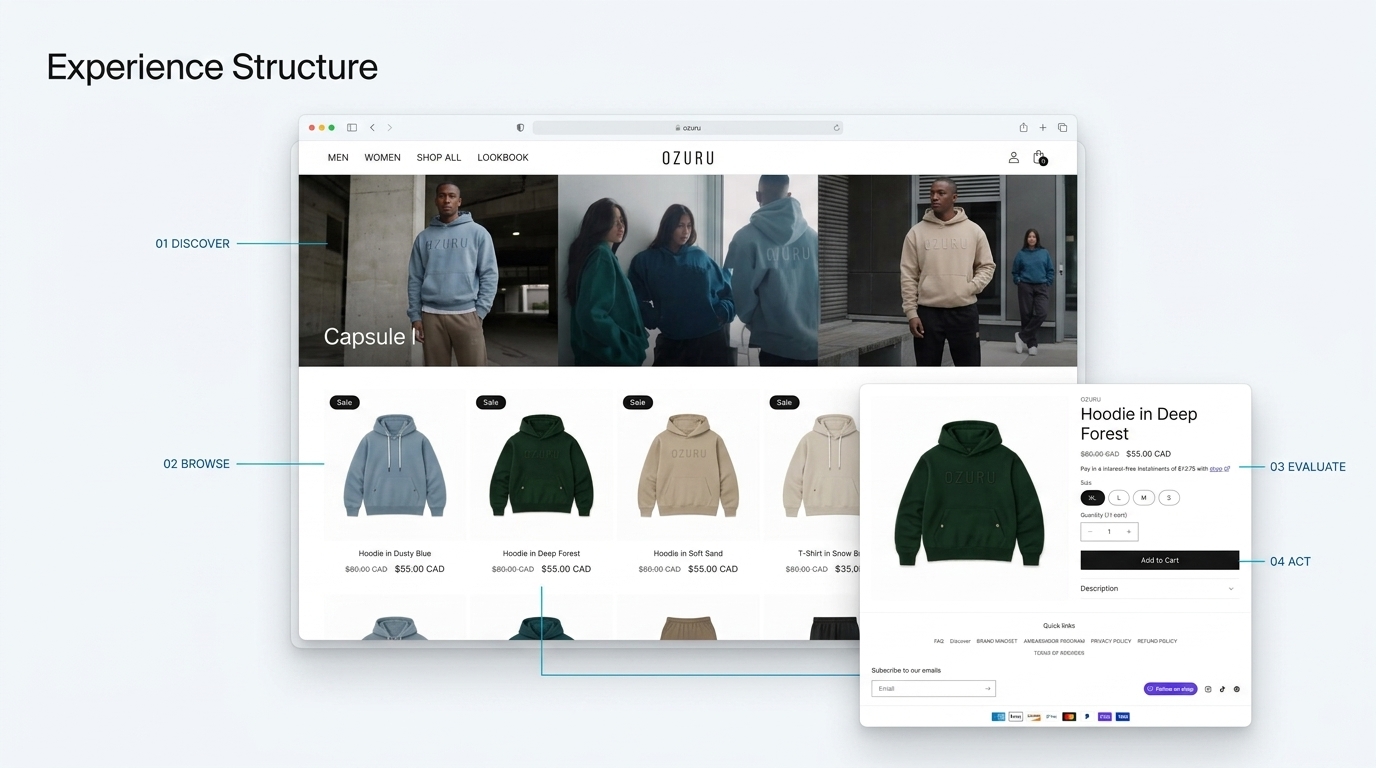
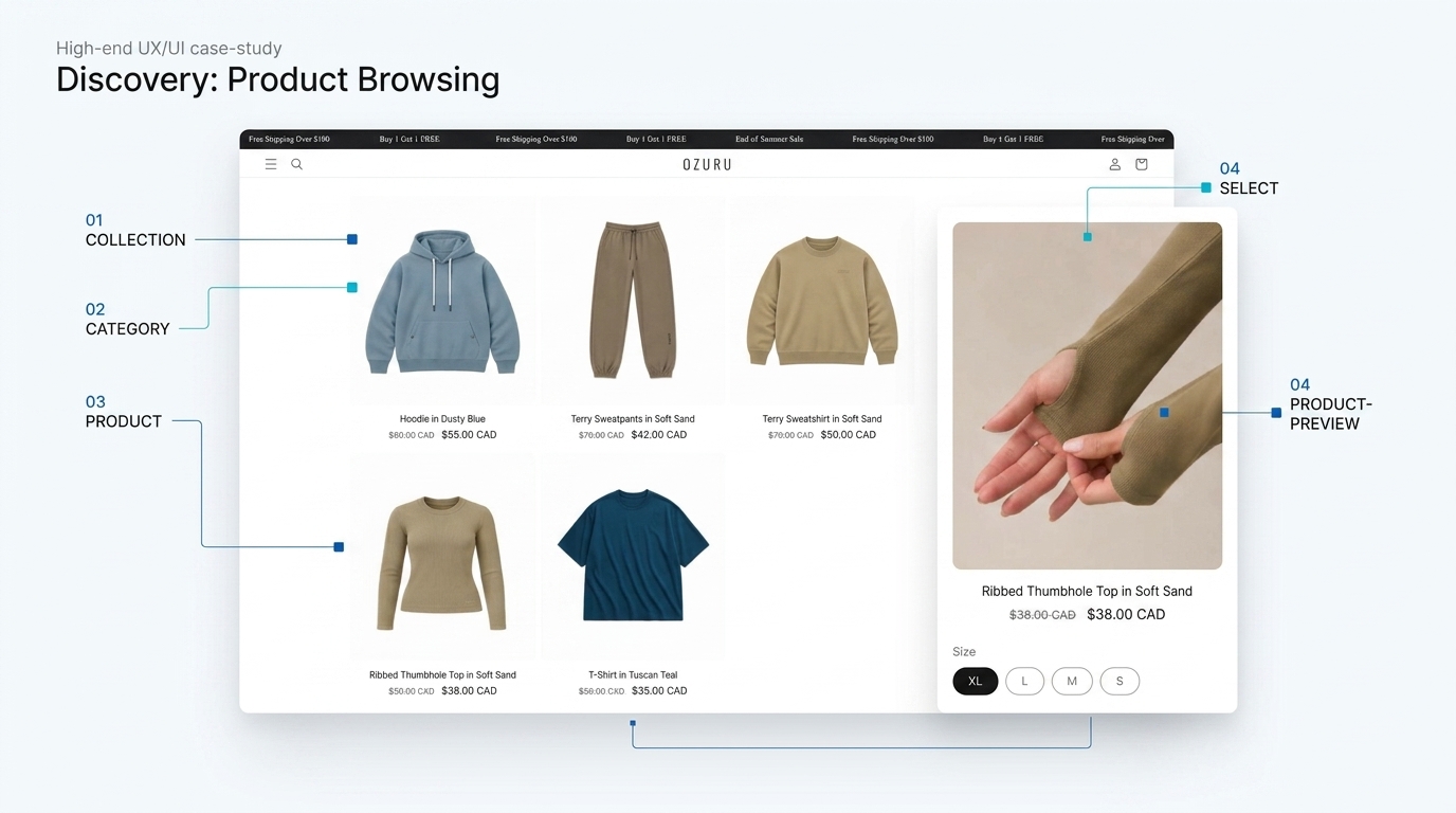
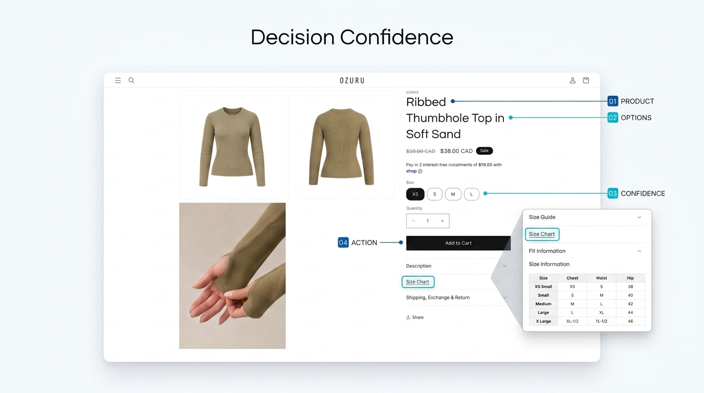
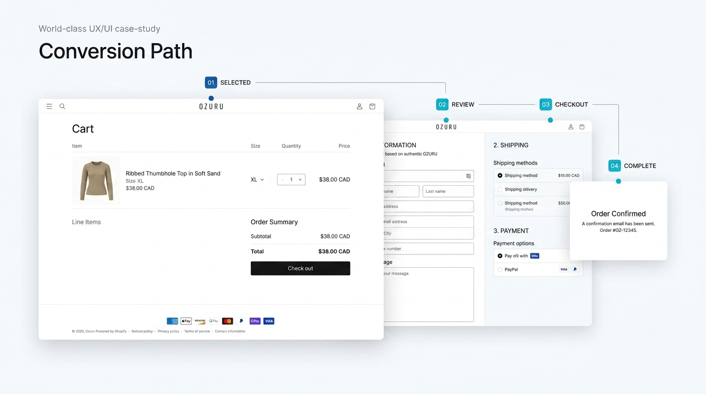
A more intentional hierarchy connects discovery to action.
The interface was reorganised around clearer decisions.
We reduced visual competition, strengthened hierarchy, and created clearer relationships between content, products, supporting information, and next actions.
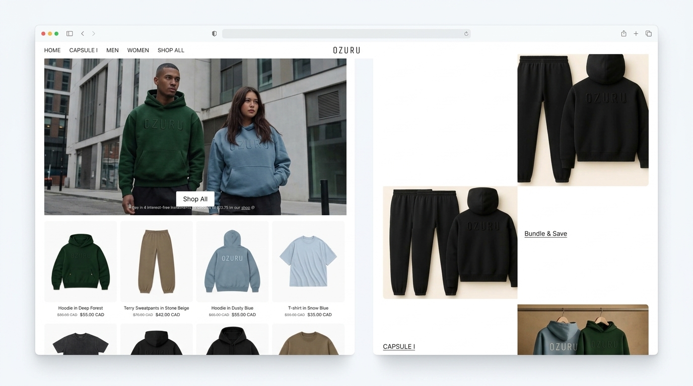 BEFORE
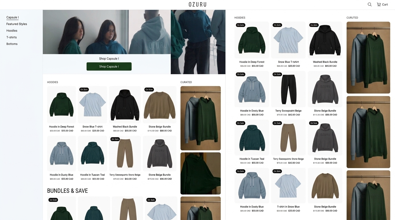 AFTER
AFTER
The objective was not visual novelty. It was to make the experience easier to understand, easier to trust, and easier to act on.
Better experience. Stronger business signals.
The redesigned experience created clearer paths, stronger engagement, and a more intentional route from product discovery to action.
Conversion uplift
A clearer experience reduced decision friction and created a more intentional route toward action.
A clearer journey created a stronger path to action.
Navigation, hierarchy, trust cues, and calls to action worked together more effectively, helping users move through the experience with less uncertainty.
Better interfaces start with better decisions.
The strongest improvement did not come from adding more. It came from making the right information, choices, and actions easier to understand at the right moment.
When structure becomes clearer, the interface can become quieter — and still perform better.
This project reinforced a simple principle: users do not need more visual noise. They need better context, stronger hierarchy, and confidence about what to do next.
Hierarchy is not visual decoration. It shapes decisions.
When important content is easier to notice and understand, users spend less effort deciding where to look and can focus more attention on the actual choice in front of them.
A few things you might want to know.
A concise look at the thinking, scope, and approach behind the project.
The project combined UX strategy, information architecture, interface design, responsive design, interaction thinking, and conversion-focused experience improvements.
The core challenge was reducing friction across the user journey — making important information easier to understand, improving discovery, and creating clearer paths toward meaningful actions.
We approached the redesign as a connected system rather than a collection of individual screens. Strategy, hierarchy, navigation, trust cues, interface patterns, and calls to action were considered together.
The redesigned experience created clearer information hierarchy, more intentional navigation, stronger decision support, improved responsive behaviour, and a more natural path toward conversion.
Yes. The exact solution should always respond to the business, audience, and user journey, but the underlying process can be adapted to SaaS, ecommerce, professional services, and other conversion-focused digital products.
Every project is different. The process adapts to the problem.
Have a challenge worth solving?
Tell us what you’re trying to improve. We’ll help turn the challenge into a clearer strategy, a stronger digital experience, and a practical path forward.
Better digital experiences start with better decisions.
TECO TOUCH / DIGITAL TRANSFORMATION